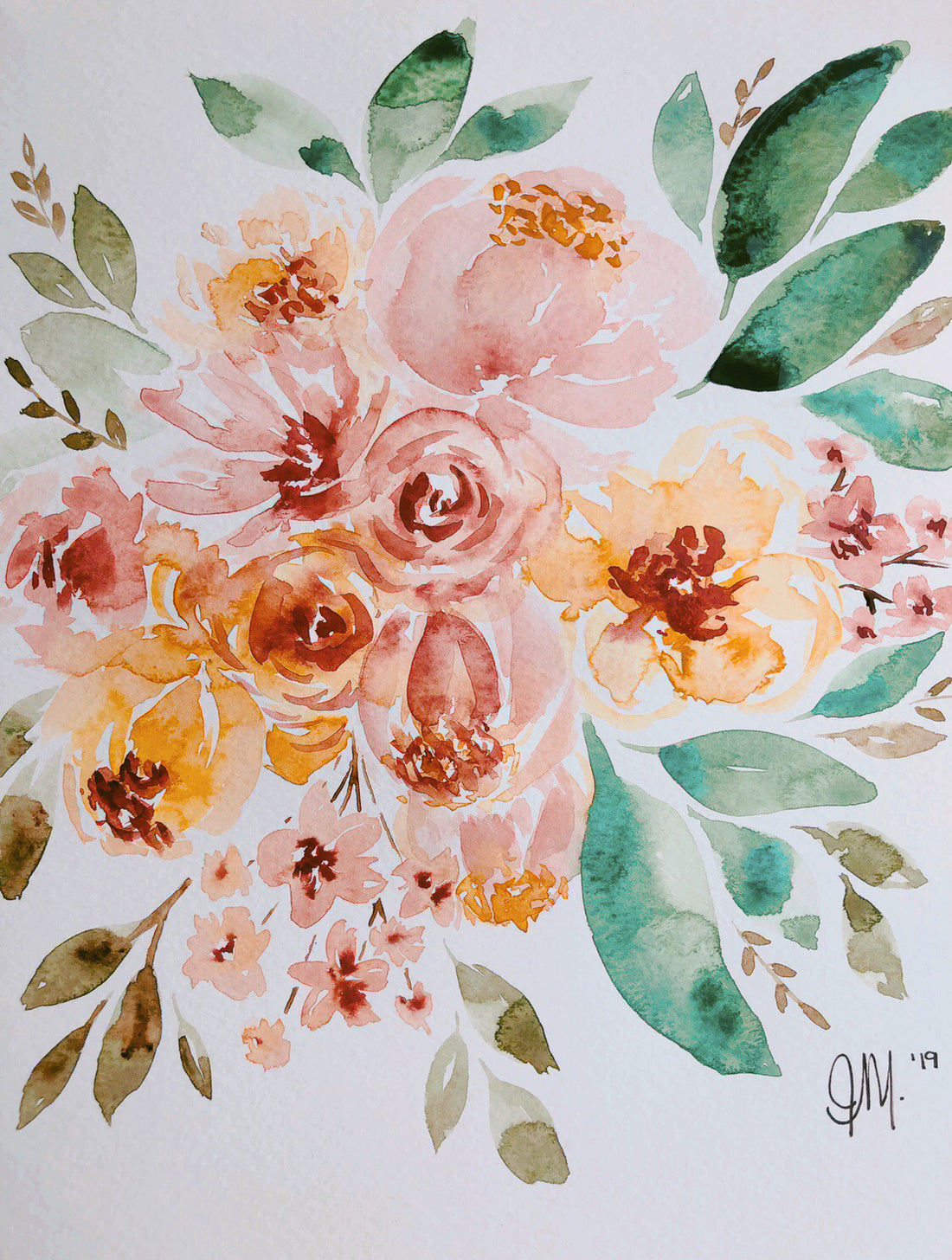
I tried to get out of my comfort zone on this one and changed up the colour pallet. I went with really warm yellows and yes brown; I had to add a bit of cool green just to make myself happy tho lol.
I'll admit I have a really hard time adding brown to anything, I don't even have that much fabric in brown in my shop. I guess we all have our preferences and in order to grow you just have to embrace the poopy colours too!!
I also used a different brand of watercolours for this painting, Winsor & Newton. I bought them off Amazon because I really liked the case (but really that's why honest)!! I love how it has all the segregated mixing spots its heaven! Unfortunately the paint is leaving something to be desired, its really chalky when it dries, not really impressed with it. For work that you are going to scan it its fine but for actually original art pieces I would pass on this brand!
Overall not my favourite piece but you got to experiment ... I guess 😘!
Details:
Paper - Strathmore Cold Press 300
Brush - black velvet #8 and #4 round
Paint - Windsor and Newton 48 pc set
Don't Forget!
Follow us on Instagram @weaveandwoven to see all our watercolour art

Happy Painting,
-J.


