Watercolour Art
Watercolours Turned into Gouache
I've been wanting to paint with Gouache for a while now but i'm really am not a fan of mixing colours with Gauche, its chunky and the colours offered don't...
Watercolours Turned into Gouache
I've been wanting to paint with Gouache for a while now but i'm really am not a fan of mixing colours with Gauche, its chunky and the colours offered don't...
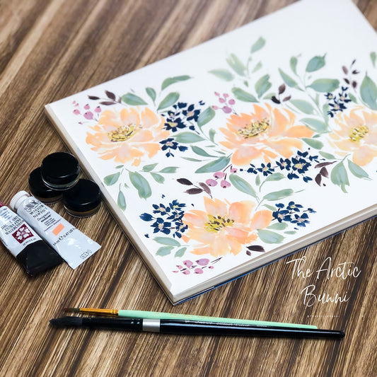
New Handmade Pallet
First Off Happy New Year Everyone! So this Christmas I splurged a little on a handmade watercolour pallet from Ocean Paper. (no ad affiliation, I purchased on my own) I've...
New Handmade Pallet
First Off Happy New Year Everyone! So this Christmas I splurged a little on a handmade watercolour pallet from Ocean Paper. (no ad affiliation, I purchased on my own) I've...
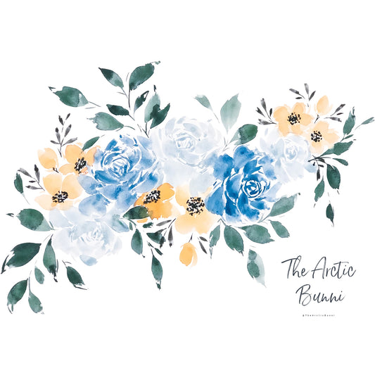
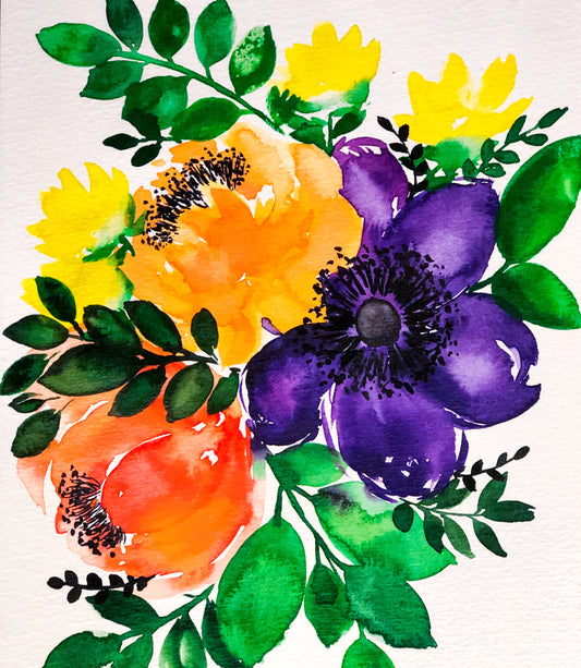
October Watercolour Florals
Feww, was it just me or was October quit crazy this year?? For the entire month I didn't have the chance to update my watercolour florals at all. Therefore, I'm unleashing...
October Watercolour Florals
Feww, was it just me or was October quit crazy this year?? For the entire month I didn't have the chance to update my watercolour florals at all. Therefore, I'm unleashing...
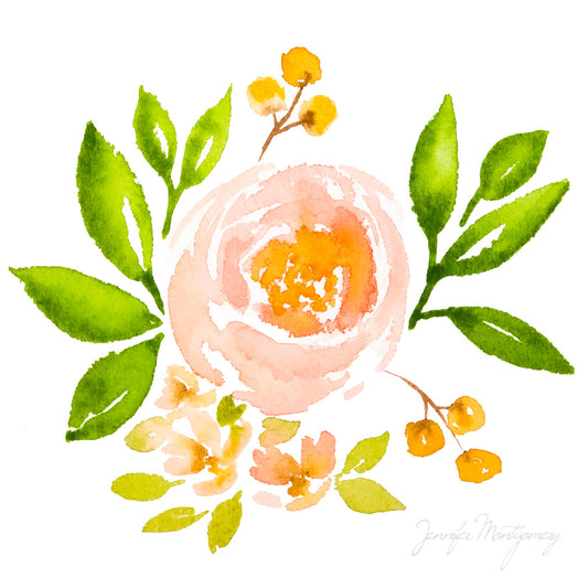
Peachy Pink Watercolour Rose
My latest watercolour project was to make another clip art piece. Slowly woking my way from painting to digitizing my art for fabric!!
Peachy Pink Watercolour Rose
My latest watercolour project was to make another clip art piece. Slowly woking my way from painting to digitizing my art for fabric!!
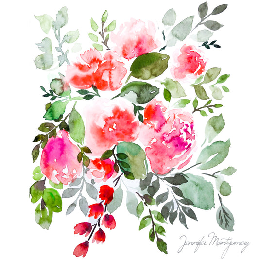
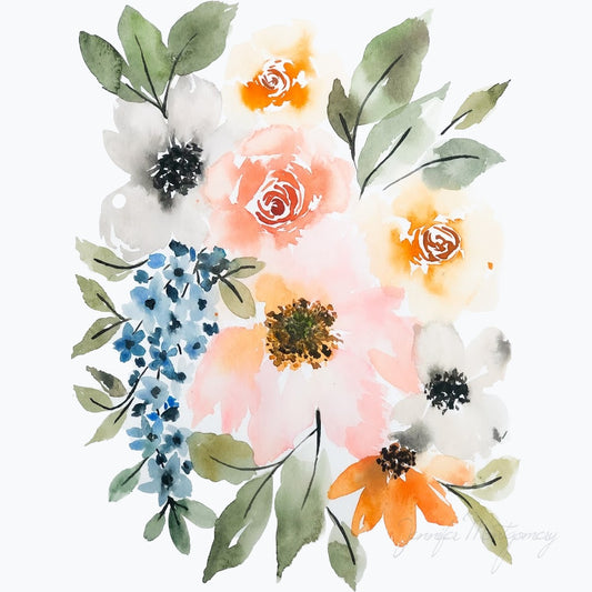
Soft Red Watercolour Blooms
A little Update on the painting front! I haven't had any spare time to paint these last couple of months, so last weekend I made some time. I wanted to...
Soft Red Watercolour Blooms
A little Update on the painting front! I haven't had any spare time to paint these last couple of months, so last weekend I made some time. I wanted to...
Watercolour Journal Blooms
To welcome in January I have dug up my old watercolour journal and added some new bouquets to it! My first painting I really wanted to play with the lilac colour...
Watercolour Journal Blooms
To welcome in January I have dug up my old watercolour journal and added some new bouquets to it! My first painting I really wanted to play with the lilac colour...